Style - September 25, 2013
Fall 2013 Color Trend: Royal Hues

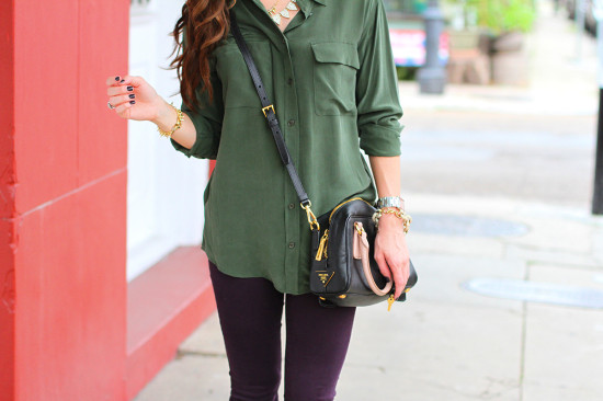
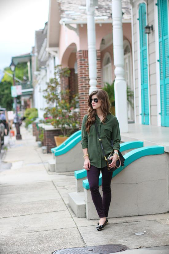
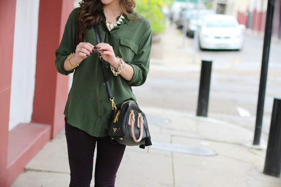
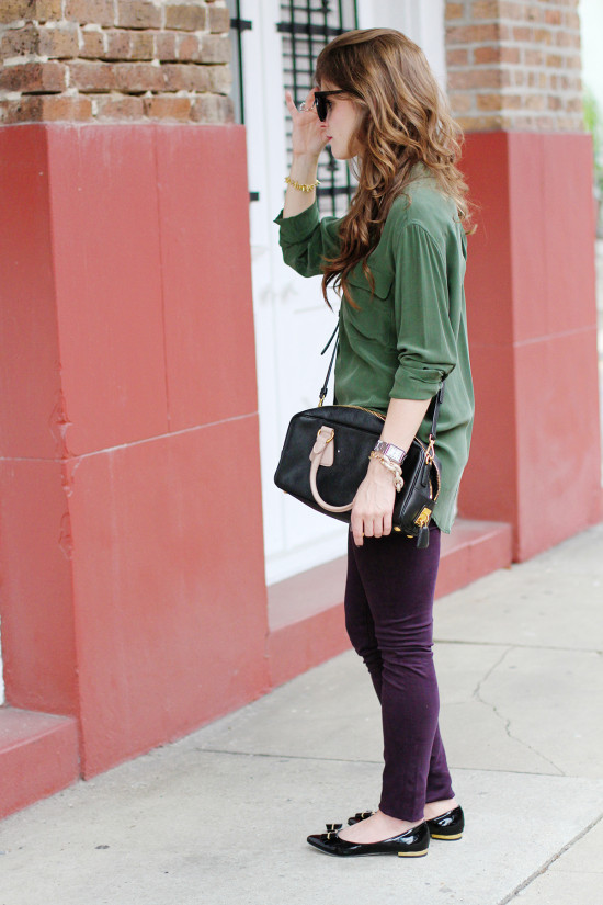
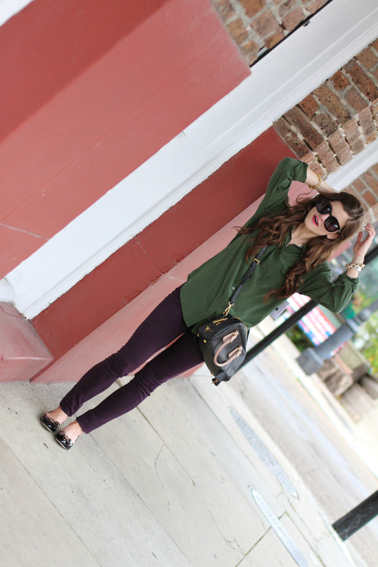
Top: Equipment Femme Signature Blouse in Dark Army // Denim: J Brand Luxe Sateen Mid-Rise Skinny Jeans // Necklace: Pave Tab Strand by Baublebar // Shoes: Dee Keller Tara Patent Leather Bow Flats by Dee Keller // Watch: Cartier // Bracelets: J. Crew Pave bracelet, Stella + Dot Renegade bracelet // Bag: Prada // Sunglasses: Karen Walker Super Duper
It took me a while to think of a name or phrase that embodied the Fall 2013 color trend that seems to be a common thread of inspiration for this season. At first, I couldn’t figure out if it was a color-based trend (a particularly “hot” color palette) or a theme-based trend (e.g., military-inspired, earthy elements), but ultimately reasoned that theme is color is theme is trend; and for the sake of simplicity and hopefully easy translation (and thus inspiration for your closet!), I decided to go with the phrase “Royal Hues”.
Style influencers at Pantone explain the inspiration as deriving from “The opulence in nature. There is something mysteriously beautiful the way nature expresses emotions visually. Shapes, textures and graphics in the wild are couture-like creations that translate into this season’s palette.” The color palette for the season is one that “create[s] moods that range from sophisticated and structured to lively and vivid, encapsulating our inherent need for wardrobe variety to reflect emotions that run from thoughtfully introspective to irrepressibly elated.” (Let it sink in. Now, if you’re on the same page as me….I’m thinking that’s a whole-lotta-hoopla essentially saying that this season’s color palette is one of many moods, attitudes, and emotions. I think. Yeah?)
With an emphasis on nature and the changing of the seasons, fashion influencers have gravitated towards rich, warm colors ranging from wineberry plum to moss green. Which is an organic transition, or evolving-with-the-seasons-of-sorts, from Spring’s emphasis on radiant, emerald green and citrus/coral orange.
Whew! So anyway, let’s point out the fact that this little number featured above shows an example of a little color-blocking action with moss green and plum/wineberry. I think blocking any of the “earthy” tones would look good! I love the idea of pairing slate gray with steel blue or navy with midnight violet.
See my FULL Fall 2013 Trend Edit, featuring my favorite trends this season!
Photos: Maureen Morphy
disclosure: all apparel thanks to Saks Fifth Avenue and is available for shopping in the store (for Saturday!) and online
Brighton Your Day
Get exclusive content, sale items, and lots of fun stuff, straight to your inbox!
Share Story:
Join the Conversation
0 / View All